Partner spotlight: building dashboards designed for clarity

5 min
read
Every so often we work with a team whose approach changes how we think about our own.
This is the first in a series where we spotlight the partners building remarkable things alongside us. We're starting with a team whose work touches something we care deeply about: making complex information feel simple.
The problem they set out to solve
Dashboards have a reputation for being overwhelming, and usually it's deserved.
The instinct, when you have a lot of data, is to show all of it. More charts, more numbers, more panels competing for attention. The result is a screen that technically contains everything and communicates almost nothing. The people who need answers end up hunting for them.
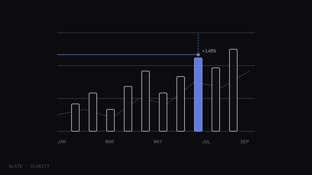
Our partner started from the opposite premise. Instead of asking "what can we show," they asked "what does the person actually need to know in the first five seconds." Everything else followed from that single question.
"A good dashboard answers a question before the user finishes asking it. If they have to study it, we've failed."
How they approached it
What stood out to us wasn't any single feature. It was the discipline behind the decisions.
They treated every element on the screen as something that had to earn its place. A chart that didn't directly serve a decision was removed. A metric that looked impressive but changed no one's behavior was cut. What remained was lean, deliberate, and surprisingly calm to look at.
Their process came down to a few repeated questions:
Who is looking at this, and what decision are they trying to make?
What's the one number that matters most, and is it impossible to miss?
What can we remove without losing meaning?
Does this feel calm, or does it feel busy?
It's a simple framework, but applying it consistently is harder than it sounds. The pressure to add is constant. The discipline to subtract is rare.
What we learned from working together
Collaborating with a team that thinks this way sharpened our own standards.
We've always believed that clarity is a feature, not a finishing touch. But seeing a partner apply that belief so rigorously to something as notoriously cluttered as dashboards was a useful reminder. The principle scales to almost everything: the fewer things competing for attention, the more weight each one carries.
It also reinforced something we keep relearning. The hard part of good design isn't knowing what to add. It's having the confidence to leave things out, especially when leaving them out means trusting the user to find what they need without being shown everything at once.
Working with great teams
Partnerships like this one are some of the most rewarding parts of what we do. We get to build alongside people who push our thinking, and our customers get the benefit of work that's been shaped by more than one perspective.
If you're building something you think fits alongside what we're doing, we'd love to hear from you.
Share this article:
Head of Design Claire Dubois leads design at Slate, from the system down to the smallest interaction. She cares most about the details no one consciously notices.